

Journal/Getting found on Google
Google judges your website by its phone version
Google reads the mobile version of your site, not the desktop one, when it decides where you rank. Most owners only ever look at their site on a laptop.
15 November 2026·2 min read
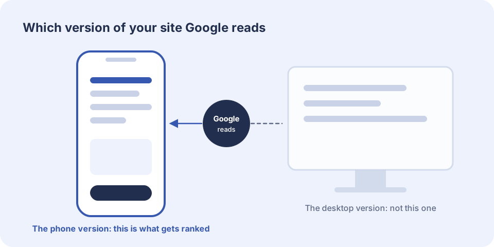
For some years now Google has used what it calls mobile-first indexing. In plain terms, the robot that reads your website visits it as a phone would. What it sees on that small screen is what it stores, and what it stores is what it ranks. If something is missing or broken on the phone version then, as far as Google is concerned, it is missing or broken, however good the desktop version looks.
It makes sense. Most searches for local businesses happen on a phone, often by someone who needs the answer now.
Where phone versions go wrong
- Content is hidden to save space. Text, reviews or whole sections that show on a desktop are switched off on a phone, and Google may never see them.
- Text is too small to read without zooming, or lines run off the side of the screen.
- Buttons and links sit too close together for a thumb.
- A pop-up covers the page the moment it opens. Google has said that pages which block their content this way may rank lower.
- The menu is hard to open, or hides pages that matter.
- The phone number is a picture or plain text, so it cannot be tapped to call.
A two-minute test
Take out your phone, turn off wifi and search for your own business the way a customer would. Open your site from the results and try to do the one thing you most want customers to do, whether that is calling, booking or asking for a quote. Count the seconds and count the taps. Then do the same on your two nearest competitors.
If you had to pinch, zoom, wait or hunt, so does everyone else.
What good looks like
A good phone page puts the important things first: what you do, where you work and how to get in touch. The phone number can be tapped. The form is short enough to fill in with one thumb. Pictures are sized for the screen, so they arrive quickly on a mobile signal. Nothing jumps about while it loads. And everything that is on the desktop version is on the phone version too, laid out differently but all there.
We design the phone version first and widen it for larger screens afterwards, not the other way round. It is the version most of your customers will see, and it is the one Google reads.